Logo Types Design in Nairobi, Kenya.
The Best logo designers in Nairobi, Kenya.
Creating a logo is a crucial aspect of building your brand.
A logo is a special symbol that helps you stand out from other players in your field. It's not just about having a visually appealing image or a combination of both colors and fonts; it's a way to communicate to your customers about your identity. Nairobi Logo Design.
We understand the significance of pinning on the most fitting image for your business. We have experience working with various types of brands spanning different industries.
Quality Logo Design in Nairobi, Kenya.
Inexpensive and impactful logo design in Nairobi Kenya.
All of our logo designs are delivered in high-resolution industry-standard formats (AI, EPS, PNG, JPG, PDF), ensuring that your business is properly represented in print and on the web.
To support your marketing activities, we also provide premium branding packages that include letterheads, business cards, flyers, brochures, and social media kits among other forms of communication design.
LOGO TYPES
Lettermarks or monogram
Lettermarks, often known as monogram logos, are logos made from letters, typically brand initials.
Consider employing a letter mark logo if your firm has a long name.
Condensing your firm's name into initials can help to simplify your design and will help clients recall your brand and logo more readily.

Wordmarks
A wordmark logotype is a font-based logo - Similar to a lettermark - that concentrates entirely on a company's name - it depicts the company's name in a distinctive way.
This type of logo is a good choice if your brand has a unique and memorable name that customers can easily recall.
Using a well-designed typeface for your name will make your brand noticeable even more.
.
Brandmarks / Logo symbols
Brandmarks or logo symbols are other terms for pictorial marks.
They are symbols that reflect the brand name, such as an icon or a graphic-based logo.
When consumers can associate the visual symbol with the company, the logo's reach is known.
It's generally the first thing that springs to mind when you hear the word "logo." A true brand mark is nothing more than an image.
As a result, it can be a difficult logotype to use for new businesses or those without strong brand equity.
If your business model is likely to alter in the future, a pictorial mark may not be the ideal option.
You may begin by selling shoes and incorporate a shoe into your design, but what happens when you expand to include kitchenware, fridges, or even produce?
Abstract logo marks
A pictorial logo is a kind of an abstract mark.
It is an abstract geometric shape that reflects your brand rather than a familiar picture such as a wheelbarrow or a handshake.
Abstract markings, like other logo symbols, perform very effectively since they reduce your business into a single picture.
Rather than being restricted to a recognized picture, abstract logos allow you to design something really unique to reflect your brand.
You may use abstract markings to create a completely distinct look for your organization.

Mascots
Mascot logos include a cartoon (graphically drawn) figure.
Mascot logos are a good way to build your own brand representative. It's frequently bright, occasionally cartoonish, and always entertaining.
Consider creating a mascot if you want to appeal to tiny children or families.
The major benefit of a mascot is that it may encourage customer engagement, making it an ideal tool for both social media and in-person marketing.

The combination mark
A combination mark is brought to life by bringing together a wordmark or lettermark with a pictorial mark, abstract mark, or mascot.
The wordings and the image can be layered together on top of each other, placed side by side, or blended to form an image.
This type of logo is a fantastic choice because the emblem and text or mascot can work together to build your brand.
It becomes easy for people to instantly identify your name with your mascot or pictorial logo if you use a combo mark! you may be able to rely solely on a logo symbol later in the future rather than submitting your name each time.
The Emblem Logo
Emblem logos typically comprise text inside a symbol or image. They are comparable to seals and badges.
Emblem logo designs are widely used by universities, institutes, and government entities. Because the logo design must adhere to rigorous guidelines, it must also be simple.
Incorporating elaborate emblem logos into a variety of marketing products might be difficult. A busy insignia on a business card may be simplified to the point of being unreadable.
Also, if you want to embroider this sort of symbol on caps or shirts, keep it simple.

Hundreds of
UNIQUE LOGOS CREATED
This is just a fraction of the Logos we have created. But you can experience different Logo designs in action.
Logo plans and pricing
Convert your audience into customers! We provide logo design services that allow businesses to personalize their logos in order to make them more appealing to their clients.
| Solopreneur | Entrepreneur | Startup | Premium | Platinum | |
|---|---|---|---|---|---|
| Concepts | 4 | 7 | 10 | 10 | 10 |
| Logo Type | Any | Any | Any | Any | Any |
| Initial Concept in | 24Hrs | 24-36Hrs | 24-28Hrs | 24-28Hrs | 24-28Hrs |
| Revisions | Unlimited | Unlimited | Unlimited | Unlimited | Unlimited (Min 10) |
| Design Window | 2 Days | 3 Days | 4 Days | 7 Days | 14 Days |
| Dedicated Designer | YES | YES | YES | YES | YES |
| Formats | PDF | JPG | PNG | PDF | JPG | PNG | SVG | PDF | JPG | PNG | SVG | PDF | JPG | PNG | SVG | PDF | JPG | PNG | SVG |
| Source File | X | AI | EPS | AI | EPS | AI | EPS | AI | EPS |
| Mockups | X | YES | YES | YES | YES |
| Stationery | X | X | X | Letterhead: 2 Concepts, Business Card: 2 Concepts, Envelope: 2 Concepts | Letterhead: 2 Concepts, Business Card: 2 Concepts, Envelope: 2 Concepts, 4 Page Business Profile, |
PLAN ADDONS
If missing in the package features list
- SVG File @ 500
- EPS/AI File @ 1,000
- Letterhead Design @ 1,300
- Business card Design @ 1,300
- Any other of your choice (Bulk purchase discount inclusive)
LOGO DESIGN STYLE
Choose the right logo style
CLASSIC
Although trendy logos can be fun and exciting, they can quickly become dated. A classic style can help you connect with a broader audience and ensure long-term success. This style keep things simple without going overboard with crazy color palettes, graphics, or fonts. The classic style logo shows that you are trustworthy, reliable and simple to work with.
HANDMADE & HANDCRAFTED
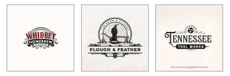
A handmade logo tells people that the brand is all about being unique and high quality. It goes nicely with other looks, like vintage, to get the message across. But it can also be mixed with simple or fun logos for a cool style that's both classy and youthful.
RETRO or VINTAGE
Vintage and retro logos have been popular for a while because they bring back memories and make people feel nostalgic. When you use a vintage logo, you're telling your customers that you value history. This style looks great with logos in brown and beige colors.
MODERN & MINIMALIST
Businesses often pick a simple and minimalist logo design to demonstrate their company's modern and fresh image. This style features clean lines, plenty of empty space, and few details, giving it a sleek and pared-back look. Opting for a minimalist and modern logo design tells your customers that your brand is up-to-date, cool, and focused on what matters.
FUN & QUIRKY
If your brand is trying to reach a younger crowd, this is a common option. Fun and casual logo designs are often colorful and cute, using symbols or drawings to create a positive and friendly vibe. Let your brand's playful side stand out by using a whimsical mascot or illustration.
CAN’T CHOOSE JUST ONE?
It’s fine to mix and match these styles based on your brand: they aren’t mutually exclusive.
A brand can be both handmade and fun at the same time.Tell us more about your business and we will come up with some fantastic ideas.

LOGO VARIATIONS
Every Brand Identity Needs
People commonly associate brands with logos, yet brands transcend mere visual symbols. While a logo is an important visual element, it does not encapsulate the entirety of your brand. Attempting to rely on a single version of a logo becomes apparent as insufficient, prompting the realization that multiple variations are essential for a comprehensive brand representation. A singular logo design service falls short of the requirements. To truly make your brand stand out and excel in the market, four essential logo design variations are essential.
In your quest for logo design services, you may have encountered terms such as submark and alternate logo, leaving you perplexed. Galactik IT is here to demystify these concepts by providing a clear explanation of the four distinct logo variations, supported by visual examples, indispensable for completing your brand's identity
What is a Logo Variation?
Logo variations do not constitute radically different visual designs; rather, they are rearranged versions of your primary logo design. These variations provide your brand with the flexibility to maintain a consistent and recognisable presence in diverse placements. Every brand requires a suite of distinctive, versatile, and complementary logo designs suitable for deployment across various platforms.
01 PRIMARY LOGO
The primary logo is the main symbol of your brand, and all other versions are based on this design. Most primary logos are wide and show the most details. Normally, this logo has things like taglines, when your brand started, or pictures.
Since it's a bit complicated and bigger, the primary logo needs a good amount of space. Make sure there's enough room around it, and it's not squished in. You can use it for big things like headers on desktop websites or large printed materials.
02 Secondary Logo
Your secondary logo, also known as an alternate logo, is another way for people to recognize your company. If your main logo doesn't fit or can't be used, you can use this alternative design.
Depending on your business, you can have vertical or horizontal secondary logos. These are usually simpler and more compact versions of your main logo. They don't have creative elements or taglines; they mainly show your brand name.
Vertical secondary logos are good for clothing tags, and horizontal ones work well for smaller prints like invoices, business cards, or mobile website headers.
03 SUBMARK LOGO / ICON MARK
Submark logos, also called brand marks or alternate marks, are small but easy-to-recognize designs. Sometimes, they have the full business name or a creative element. If they use only your brand's initials, they're called lettermarks. Submarks are handy in tight spaces where a bigger logo wouldn't fit.
Although making a big logo into a tiny submark can be tricky, the outcome is a very flexible and creative version. You can use it in places like the website footer, social media posts, and small printed materials.
04 FAVICON
Most of the time, people don't really notice favicons unless they're missing. They're like tiny brand icons, even smaller than submarks, usually showing just your brand's initials or a small picture.
On your computer, look at the little icons in the corner of your open tabs – those are usually favicons. They're tiny marks, either square or circular. Favicons add a final touch to a website's branding. If a website doesn't have its own favicon, it shows a generic icon, which doesn't look great.
Whenever we work on web designs, we always make and use favicon logo versions. If you use our logo design services, we'll give you one.
WHAT MAKES A GOOD LOGO
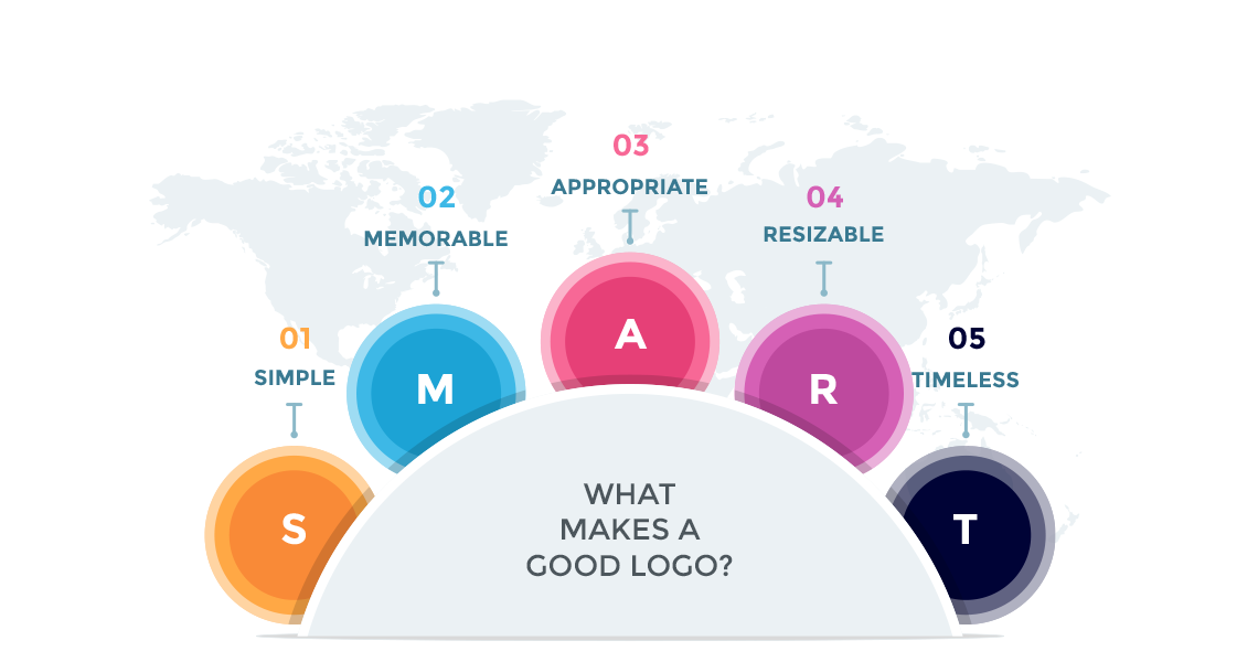
A quality logo is immediately identifiable, conveys your brand's message, and distinguishes itself in a crowded space. An impactful logo seamlessly integrates with a brand's identity, exuding professionalism. Moreover, logos should be versatile, performing effectively at any size and in diverse contexts.
How does one create a successful logo?
Creating a successful logo requires careful consideration. When evaluating your logo options, ponder over these fundamental questions:- Can people discern the nature of your business immediately?
- Is it simple and memorable for your customers?
- Does it exhibit versatility, suitable for application across various mediums?
- Will it endure the test of time, or will it necessitate redesigning in a few years?
- How distinctive is it? Will it effectively distinguish you from your competitors?
- Are you effectively targeting the right audience with this logo?
A good Logo:
- Exhibits Uniqueness and Distinctiveness - Simple
- Leaves a Lasting Impression - Memorable
- Reflects Your Brand Identity - Appropriate
- Functions Effectively at Any Scale and in Any Context - Resizable
- Stands the Test of Time - Timeless
In the process of designing your logo, it is imperative to adopt a holistic perspective. Prioritize what aligns with your brand's objectives rather than personal taste. This is where professionals, such as Galactik IT, can offer valuable assistance in crafting the ideal logo for your brand
FAQ
Want to create your own package?
Contact now.
