

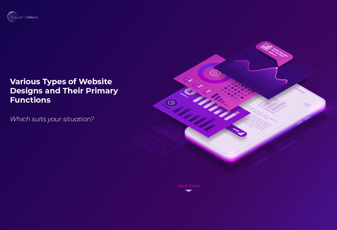
Impressive website design in Kenya, among other things, can help businesses improve their sales, customer outreach, and revenue. If you want to launch a beautiful and functional website in Kenya, you should first determine the type of designs that are best suited for your business or company. In this article, we list some of the most popular website designs in Kenya and site layouts.
What is Web Design in Kenya & beyond
What exactly is web design in Kenya and beyond?
Web design in Kenya is simply a technical process that entails building and designing various web pages to form a website for the internet.
Despite the fact that this process calls for additional resources & skills, such as software programming and development, the design phase of it majorly focuses on the user interface(UI) and experience(UX).
The functionality, appearance, content, and style of a website combined have an impact on the user experience.
Web designers work hard to figure out the best way to display a website's content in a way that is both useful and engaging to users. Depending on the site's intended function and demands, web designers may use a variety of designs and complementary layouts to accomplish this.
Website Design Types in Kenya
Here's a rundown of several website designs and when they're ideal to use:
1. Single page
One-page layout websites present all of their content on a single page. Visitors can scroll down to see all of the content on a single page that can be as long as the designer desires.
Many businesses and organizations use a linear journey or narrative to create a flow to the content provided to visitors while designing.
Because it has so many different applications, this design style may be extremely versatile. It could be used to sell products while also telling the company's story as the page progresses, or for artists to promote their work. A great consideration when designing landing pages.
2. Static website
A static website is one that has the same design across all platforms and requires little to zero user interaction.
Such websites are frequently built with the most fundamental web technologies, such as HTML and CSS, and have a small number of pages.
Given the aforementioned facts, the development cost is low. Static websites are the best choice for communicating only because of their simplicity and limited ability to connect with users.
3. Dynamic website
Dynamic websites, as opposed to static websites, allow visitors to interact with the content on the page, resulting in a more active and engaging website design. The programming required to create these types of websites is often more versatile, such as PHP, Python, JavaScript, or ASP.NET.
Because of their more complex architecture and design, dynamic websites can be more expensive and take longer to load than static websites. They may, however, use an appealing display to effectively communicate information and the benefits of a service or product.
4. Responsive design
The layout and presentation of content on a responsive website design in Kenya differ depending on the browser size. The website can rearrange itself to cover any size screen with the most relevant content, whether viewed on a mobile device or a PC browser, by scaling graphics and wrapping text.
This design is beneficial to many websites and organizations because it allows visitors to access information and items across multiple devices.
5. Liquid design
A liquid website design is similar to a responsive website design in that the layout of the page does not change depending on the screen size.
The design shrinks or expands the entire webpage to fit the size of the selected window, which may be useful for websites that don't want to sacrifice content due to browser size. However, when viewed on displays that are too small or too wide, the design may have very small or deformed text.
6. Fixed design
Designers can create a website with a fixed design that does not change depending on the window or screen size. The site uses a high resolution and will open to those precise measurements whether the viewer is using a mobile device or a computer display.
The high resolution allows web designers to create a consistent website layout that works on all devices. On the other hand, users with smaller displays may find this inconvenient because scrolling across the website and finding the information they require may take longer.
Types of website layouts
Here's a rundown of distinct website layouts and which ones profit the most:
1. F-shape layout
The F-shape layout creates a website that follows the visitors' general viewing pattern. Website visitors frequently look and move their eyes around a webpage in a F or E form, according to scientific research.
Websites that are designed to follow visitors' natural eye movements will capture their attention more effectively. These layouts are especially common on websites with a lot of options for visitors to choose from, like news sites and search engines, because they allow users to quickly scan the options and make a decision.
2. Z-shape layout
The z-shape layout is similar to the f-shape layout, but it is targeted at a different demographic. People from western cultures, according to scientific research, navigate the pages of various websites in a z shape rather than a f shape.
Z-shape layouts are particularly useful for websites with a single goal, such as encouraging visitors to sign up for a service or make a purchase. Including a button on the z-shape path that leads to the next stage of corporate engagement can help increase customer outreach and revenue.
3. Grid of cards layout
Users or website visitors can easily change the information displayed in a grid of card layout by adjusting the size of the browser window or screen. Video streaming websites that provide image previews for their many video options are the most common sites that use a grid of cards style.
Each preview is displayed as a grid of cards, with the number of video options available varying depending on the screen size.
Because it helps customers find what they're looking for, a grid style is ideal for websites with a lot of options and equally important information, such as video streaming services or eCommerce
4. Boxes
The boxes layout uses one large box as the website's header, which displays an image, and two smaller boxes beneath it that provide users with additional images or information. Each box informs the user about the company's or website's mission and links them to other dynamic webpages where they can learn more.
Because the boxes can prominently display images, artists and businesses alike use this layout to showcase their portfolios and featured products.
5. Split screen
A split-screen layout partitions a website into two sections/segments, each of which the user can browse separately. This layout is ideal for companies and organizations with two types of data that their customers value equally.
The split-screen layout could be used to promote products in a store that sells both women's and men's clothing, for example. Customers can quickly choose between the two options on the first page and proceed to browse the website.
6. Fixed sidebar
On the left or right side of the webpage, a permanent sidebar style displays a stationary menu of options for users. Visitors will find it easier to navigate the site with this sidebar menu, which provides quick and useful navigation options.
The fixed sidebar style is best for websites with few pages, such as those that sell a single main product. For example, if a watch company used a fixed sidebar, the menu options might be: about us, online shop, and contact us. This layout is also common with web applications and website admin dashboards.
7. Magazine
The magazine layout is meant to look like printed magazines. A column and grid system is used in this design to present a large amount of information to visitors while also making navigation easier.
Publishing houses frequently use magazine layouts to simulate how their product will appear in print, which can make reading and exploring more enjoyable and engaging for customers.
8. Asymmetrical layout
Asymmetrical layouts ensure an unequal design on the homepage, with one half of the page typically larger than the other. Businesses and organizations frequently use this layout to create an aesthetically pleasing webpage while also directing visitors to a specific section of the site.
For example, a company might use the larger section of the website to display a logo or brand motto, while the smaller section is used to encourage visitors to enter their contact information so that they can receive information about special offers and promotions.
The smaller part usually draws the visitor's attention, encouraging them to interact with the website or company. Because of its versatility, the asymmetrical style is frequently used on a website's homepage to entice site viewers.
9. Featured image
The featured image layout places a large and prominent image at the top of the homepage to attract viewers. Almost always, the featured image is a photo of a popular product that a company or business is promoting.
Companies that sell aesthetically pleasing items frequently employ this layout to capture visitors' attention and persuade them to make a purchase. A company that sells computers, for example, might use a featured image layout to emphasize the design and style of their computers.
10. Curated Visuals
The curated visuals layout promotes a product or service by using illustrated graphics.
Businesses and organizations frequently use this style to convey a specific emotion that they want visitors to feel when they visit their website.
Customers may be inspired to connect with the brand and possibly purchase their products and services as a result of this type of advertising.
Typically, businesses or corporations that provide a complex, difficult-to-market service will use curated graphics to help smooth the experience and communicate important information to customers.
